Do you go blank when you think about creating a CTA? You’re not alone! We’ve all been there, desperately searching for examples that go beyond the standard “Shop Now” phrases. But what if your CTAs could be highly clickable and boost conversions? In this post, we’ll unveil some of the most effective CTA examples you’ve ever seen, packed with unique elements that will inspire you to write CTAs your audience can’t resist. Grab your notepad because it’s time to take your CTAs from bland to brilliant! Let’s get started!
What Is A Call To Action?
CTA, which is call-to-action, is a clickable button or link which you may find on a website or email. Following are some typical examples of CTAs:
- Subscribe
- Sign up
- Buy Now
- Learn more
CTAs should be both simple and attention-grabbing. If your CTA is just like others, it won’t catch anyone’s eye. Users won’t pay attention to it. So, before using a CTA, think carefully about it.
Types of CTAs
Did you know there’s a variety of ways to craft effective CTAs? Here are some of the most commonly used ones:
Forms
You’ve likely encountered many submission calls to action (CTAs) on websites. These CTAs are strategically placed to guide visitors into the lead funnel. Marketers incentivize visitors by offering something valuable in exchange for completing a form. By filling out the form, visitors share their contact information and other details that provide businesses with insights into the user’s personal interests and buying behaviour. By analyzing this data, marketers can personalize their outreach and craft specific actions to nurture each lead, significantly boosting their chances of conversion.
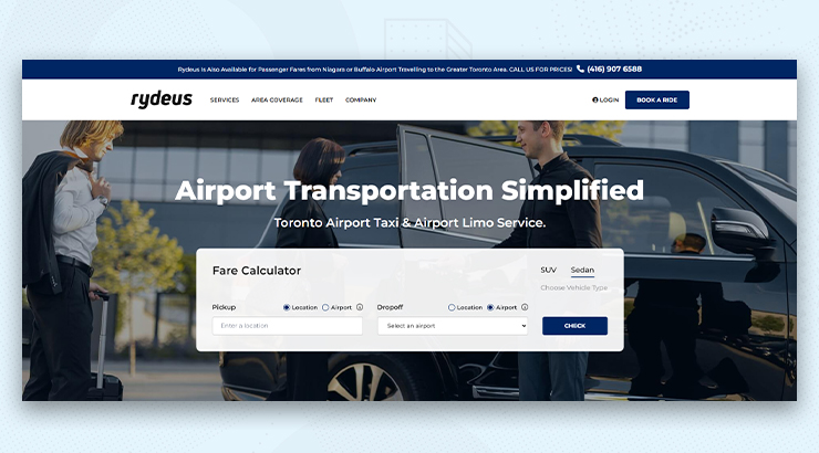
Buttons
No matter the platform, buttons remain a dominant choice for displaying CTAs. These are icons with attention-grabbing and action-provoking phrases written on them. They usually have high contrast colours on them so that they are easy to spot for a user.
Contextual Links
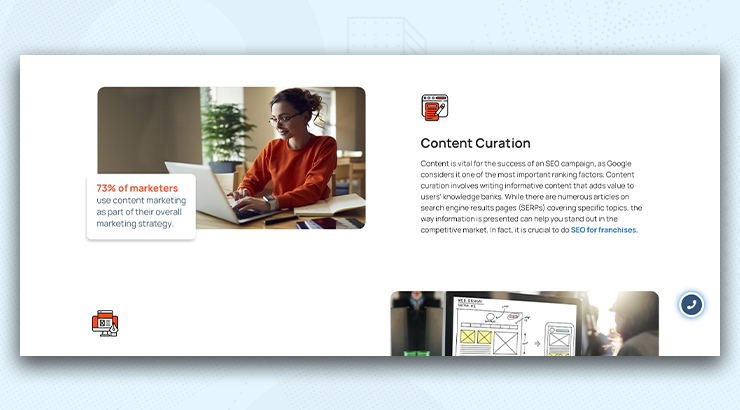
Blog posts often contain contextual links. These links appear as clickable text within the body copy and lead users to relevant landing pages.
Banners
Eye-catching banners with clear calls to action (CTAs) grab visitors’ attention wherever they’re placed on a webpage – top, bottom, or sides. These clickable elements use clear messages and attractive designs to get visitors to click and take action.

Slide-Ins
A temporary pop-up that appears on a webpage, often sliding in from a corner or the bottom of the screen. These strategically placed elements gently guide users towards specific actions, all while maintaining a smooth browsing experience. Unlike traditional pop-ups, they don’t block the main content. They effectively promote special offers, gather email signups, or guide users to relevant content on your site.
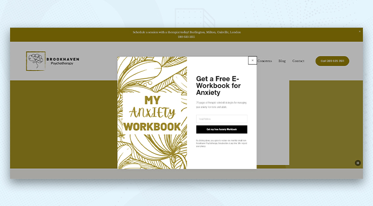
Pop-Ups
They overlay the entire screen or a significant portion, completely blocking the content behind them. They are often considered more disruptive to the user experience as they block the content the user is trying to access. They typically appear on a pre-set timer, upon arrival at a specific page, or when a user tries to leave the website (exit-intent pop-ups). They can be highly effective at grabbing attention, but they may also frustrate users if not used strategically.

How to Create Powerful CTAs?
Before creating a Call to Action (CTA), it’s important to understand its purpose and how it fits into your marketing strategy. Here are some key points to consider:
Purpose of CTA
CTA guides potential customers toward the actions that benefit your business, like making a purchase or learning more. Its main goal is to convert a visitor or reader into a lead or customer.
Clarity and Relevance
Your CTA should be clear and provide a direct message about what you want the user to do. It needs to match the content it’s linked to.
Placement
Where your call to action (CTA) is placed makes a difference. A well-placed CTA is easy to spot and aligns with the flow of your content, making it more likely to get clicks.
Design
Your call-to-action design should catch attention while blending well with your page or content’s overall design. It needs to look good and catch the eye.
Copy
Make your call to action irresistible! Use action verbs, highlight gains, and instill a sense of urgency. Use strong command verbs like “Buy,” “Register,” “Subscribe,” or “Download.”
Value Proposition
Explain the worth of what you’re providing. Clearly state the advantages and what the user will receive by clicking on your CTA.
Testing
Make sure to try out various versions of your CTAs to find out which one works best. This can include testing different texts, colours, positions, and sizes.
Follow-Up
Have a plan for what happens after someone clicks on your CTA. This might be a page for thanking, an email confirming, or the following step in your sales process.
How to Use CTAs?
How many CTAs should you use per page? One or multiple?
According to Databox’s findings, 43% of marketers mentioned using only one CTA per email, whereas 30% used two. The reason for this is straightforward. Offering too many options to your subscribers can lead to confusion and may prevent them from taking any action at all. Wordstream says that having just one action in emails can boost clicks by more than 371% and sales by about 1617%.
Make Your CTA Match Your Visitors
The secret to a good call to action (CTA) is making it relevant. Your CTA should match how interested the person visiting your website is.
New visitors need a gentle push. When someone sees your site for the first time through an ad, they might be curious but not ready to commit. A strong CTA like “Book a Free Consultation” might be too much.
But if people already know your business, they’re more likely to respond to a stronger CTA. They trust you and know what you offer.
Breadcrumb the users
Don’t overwhelm the user by asking for their information right away. Instead, offer them a free trial or a quick quiz to show them something enjoyable awaits them. Once they’re interested, guide them to the next step with a clear message. Make sure it’s easy to find. Each step should have a clear purpose. Finally, avoid confusing them with too many CTAs. Leave a clear message at the end.
Use Strong Verbs, Bring Clarity
Creating compelling CTAs is important for getting people to take action. Let’s talk about two important parts of making great CTAs: strong verbs and showing benefits.
Instead of “Learn More,” use words that tell people exactly what to do. Research from Copyblogger shows that good CTAs can make a big difference, boosting how many people take action by up to 93%.
Examples: “Unlock Your Free Trial,” “Download Now,” “Start Your Free Consultation”
The other thing is don’t just say what to do; say what people will get out of it. Neil Patel, a marketing expert, says CTAs should focus on what the person gets, not just what the business wants.
Instead of “Subscribe,” try “Subscribe for Exclusive Discounts.”
Make sure your CTA shows what people will get so they want to click.
By using strong verbs and showing benefits, your CTA becomes more than just a command – it becomes an opportunity to get something valuable.
Here are some more tips:
- Keep it short. Try to use 2-5 words that pack a punch.
- Test different CTAs. Experiment with various versions to determine which resonates most effectively with your audience.
Limited Time Offers
- Use time limits to boost conversions. Research shows this can increase conversions by up to 80%.
- Highlight time-sensitive discounts like “Get 50% Off Today Only!” or “Offer Ends at Midnight!”
- Instill a sense of urgency to encourage prompt action and evoke FOMO (Fear of Missing Out).
Trigger FOMO (Fear of Missing Out)
- Trigger the fear of missing out. Studies reveal that 69% of consumers are more likely to buy from brands that make them feel exclusive.
- Use CTAs such as “Join the Insiders Club” or “Limited Spots Available!”
- Offer exclusive content or benefits to encourage prompt action.
Test and Refine
- Experiment with different CTAs to find what works best for your audience.
- Use A/B testing to compare variations in wording, colours, and urgency.
- Analyze which versions drive the most clicks and conversions.
Data-Driven Decisions:
- Utilize A/B testing results to understand what resonates with your audience.
- Refine your CTAs based on data insights.
- Continuously optimize your CTAs for better performance.
Wrapping Up
Crafting effective call-to-action (CTA) buttons requires clarity, relevance, and strategic testing. By focusing on these key principles and using tactics like time-sensitive offers and FOMO triggers, you can optimize your CTAs for better performance and drive action from your audience. Keep refining your approach based on data insights to continually improve your CTAs and boost conversions.