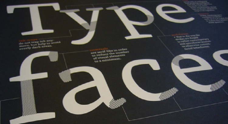
For any designer, combining the existing typefaces to create something new is a challenge. Blending two or three fonts is responsible for taking the current design to a whole new level. You might come across dozens of means when trying to combine varied typefaces, while some of them would seem seamlessly impressive, others might fail to bring out the expected outlook. To make sure you come out with a blend that appears visually remarkable, you should understand the role of each typeface and focus upon their individual qualities.
-
Know how much font you require
Practically, a single typeface design is rare to find. The reason is quite simple. Most of the designs feature a logo with text in it. The typeface used for the text in the logo is, however, not going to work for the body text. After viewing several websites, a thumb rule that we deduced is that your website should not be using more than three typefaces in a single design, considering one of them is already used in the logo.
In most of the websites, when you go through the layout, you will notice that a single typeface is dedicated to the headings alone. To make sure that all the titles stand ahead of the body text, a single typeface is used; for the rest of the body text, a different typeface is incorporated. In case you do not want to use a different typeface for text, you can still highlight them through the use of bold variation and a different colour scheme.
Statistically, font files are known to utilize nearly 65 kb in general, and if you are making use of the italic font, then it is going to add almost 200 Kb to the download data. So, when you use fewer fonts, you are also doing justice to the downloading speed of the web-page.
-
Selecting a practically viable font
In most cases, the choice for fonts that could be used for a website depends upon the client’s requirements. Mostly, the choice is out of your hands as companies specify typefaces of their own choices. In that case, the options are restricted. However, if you get the right to choose the font type and size, then there is a lot that you can rely upon.
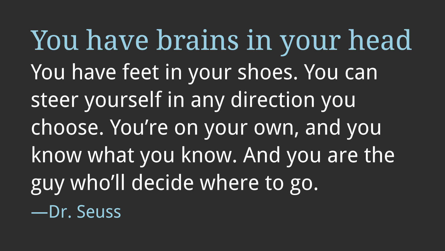
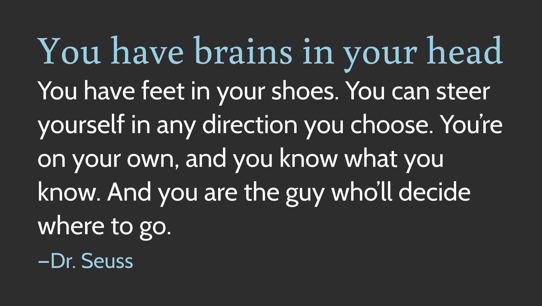
In this case, your primary concern should be selecting something that adheres to the readability factor. There are two things that you can do. The first one is to master a few font types and rely upon them most of the time. Another option is to reinvent something new every time you go ahead with some design. For instance, you can depend upon some go-to typefaces such as Droid Sans, Noto Serif and Niagara Solid or go abroad with something new every time.

Selecting a personality font
Well, when it comes to choose the first typeface, you will have to pick one based upon the readability factor. It is actually a delicate process asking you to opt for something quite skillfully. However, when choosing the second typeface, you shall consider these two elements.
Now, the foremost thing that you should consider is that the second typeface should depend more on practical usage than personality. We mean that the font should not be restricted to the personality factor. In case the two faces have the same characteristic, then upon blending, they are going to get enhanced. The second factor is that the typeface should complement the first typeface to create consistency. Sort out all those faces that have similar proportions and similar counter shapes. These two options are surely going to help in selecting the second typeface.
A safe bet, in this case, is when you choose typefaces that have been designed with a companion typeface. For instance, serif has sans-serif, Scala Sans has Scala Serif, Meta has Meta Serif, and Droid Sans has Droid Serif etc. When you combine companion fonts, you get a sufficient degree of contrast. So, if you are not that good at blending typefaces, you can always rely upon this option of relying upon companion fonts.
Companion typefaces Droid Sans and Droid Serif
Another viable option is to rely upon contrasting styles. You can compare all the characteristics. The best way is to recognize the primary character from your first typeface and then find a secondary option that shares that very attribute. It may seem challenging, owing to the fact that you have to go subjective in this case. However, once you crack it, you are sure to come across some pleasing combinations.
For instance, Cabin is a subtle version of sans-serif with very little contrast. It has a characteristic resemblance to geometric sans-serif. Together they generate a successful corporate face. When looking for a type that contrasts with Cabin, you can settle for something similar to Buenard.
Typefaces with contrasting forms, Cabin and Buenard