For someone who is running a website, the concern is to get conversions. Low conversions are a sign of lesser loyal buyers, a decrease in profits and a fading brand reputation. To make sure this is not the fate of your website, you should start picking out the mistakes that are leading to lower conversion rates.
You will need to design your website in a way that it succeeds to avail maximum profit through conversions. Let’s see the top usability mistakes that are knocking down your conversions.
Websites that are pretty but lack usability
Are you one of those who are running websites that are high on design and alluring enough but lack relative usability? Imagine you are a customer yourself who is looking for some apparel. Where would you prefer to stop by, one that is pretty or the other that is less alluring but offers better prices? You will settle by the second one, considering that it is serving your purpose.
Then why do you expect people to make purchases considering the outlook of your website alone? Although there are visitors who conclude that the site would be good at services because of its pretty layout. As a designer, you will have to ensure that your website’s design answers questions such as:
– Forte of the website
– Target Audience
– Key essentials
– Alluring Elements
– USP of the website
Failing to incorporate any of these elements would make it difficult for the audiences to understand what the website stands for. The best example to explain this would be the website below. Are you anyhow able to guess that the site is regarding truckers seeking employment? Not at all! That is because of the generic content that lacks useful details.
For more details on conversion-centred website design, check out our post, Time To Focus On Conversion Centered Design.
When looking forward to increase usability, you will have to start with wire-framing. Each of the web-pages should be crafted while setting a goal. The goal is to highlight the USP for each of the web-page. Try incorporating a wire-frame as it acts as a visual guide that displays the website’s framework. For successful wire-frame, you should start while creating buyer personas. Buyer personas are the visual guides based upon –
- who the buyer is
- the product/service that he or she is looking for
- what could be done to motivate him/her
Seeking information for the purpose is not an easy task. It takes extensive research and evaluation. Run surveys, ask questions from your customers and salespeople to get an idea of where to start from. Once you have accumulated the data, you can indulge in wire-framing as it lets you develop the right message for reflecting the requirements of your buyers.
The resulting page should be answering the two key questions- firstly, what the site offers and secondly, how it benefits the visitors. For instance, consider the web page below, it answers both the questions.
Last but not least, you will have to include details in the wire-frame such as Call To Actions, images, social proofs, reviews, testimonials and content.
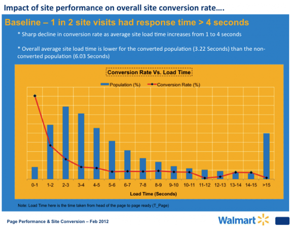
Slow Website Load Time
We are in 2020, and having a slow website is a shame. Visitors come across several other sites that run at a faster pace, and hence they expect to experience similar speed when they visit your website.
The following graphic from hobo-web.co.uk paints a realistic picture of how a delay in even a single second can lead to a jump in significant abandonment by visitors. If a visitor leaves, chances are they will not return. Thus, the optimization of the page loading time is an absolute must before you launch it for the customers.
The usability of a website lies in its polishing by using optimization metrics and tools to give your visitors an ideal user experience. This pushes the traffic, as well as the conversion rates across the finish line.


